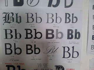
The main problem a lot of us are trying to avoid is decorating or illustrating our letters. We need the letter form to do the work, not the illustrative parts that make it up. And, of course, the key thing is to keep it nice and simple. And it's important to make the right choice with a typeface, since it has to relate with the words we are trying to get across.
Right now, we have gone back to do some thumbnails to illustrate our word. Then we can then use these thumbnails to help us generate new ideas with our letter form later on.
Sans Serif Typefaces
Slab Serif Typefaces
Font Catagories
Typeface Thumbnails


No comments:
Post a Comment